Abeles & Heymann
Branding | Packaging | Rebrand | Illustration | Advertising

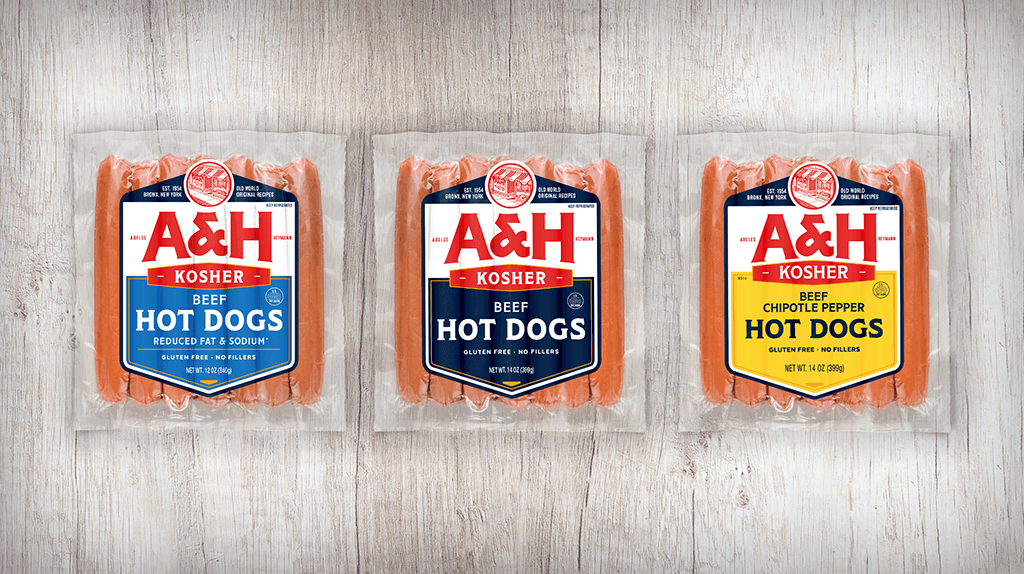
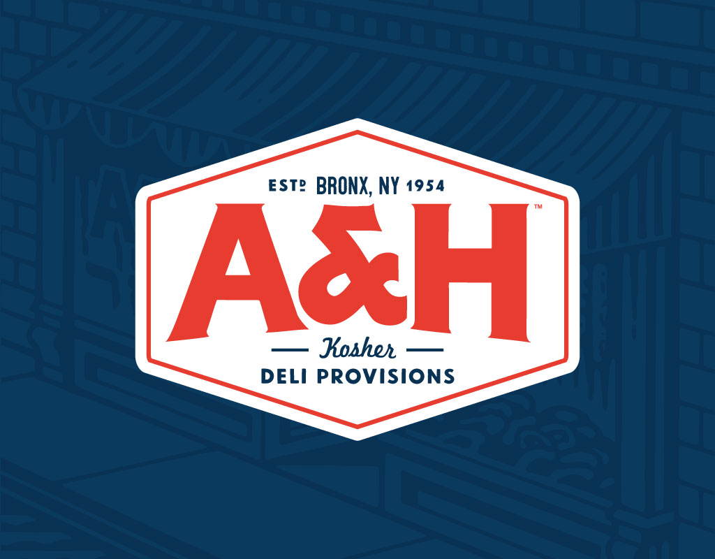
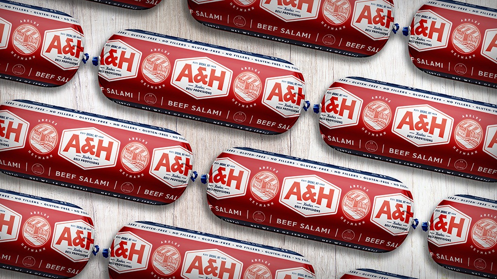
Abeles & Heymann (better known as A&H) was established in 1954 in New York. This respected New York deli brand makes kosher meat provisions known for their authentic taste and superior quality. Over time, the brand lost some of its old-world appeal. Miller worked to bring the A&H brand voice and aesthetic back to its 1950’s NYC roots. The new logo and packaging were inspired by mid-century NYC kosher delicatessens and butcher shops, conveying the authenticity, heritage and quality that A&H had become known for. The goal of the Abeles & Heymann rebrand was to retain on-shelf recognition, while reclaiming the brand’s heritage appeal. In addition, the brand needed to better communicate its superior-quality ingredients and recipes, attract new customers, yet still be recognized by its existing customer base. To achieve these goals, we recreated the logo to emphasize “A&H” as the primary identity, introduced a scratchboard-style illustrated seal featuring the original deli storefront, and organized packaging information and hierarchy for better clarity and attractiveness on busy store shelves. We also created a print ad campaign to let customers know to look out for A&H’s new look on shelves. Loyal customers readily embrace the new look. The brand continues to rapidly grow its market penetration, especially with A&H uncured and certified kosher hot dogs, a first in the natural hot dog category!
abeles-heymann.com

